You probably do not understand heatmap! Please read You probably don’t understand heatmaps by Mick Watson
In the blog post, Mick used heatmap function in the stats package, I will try to walk you through comparing heatmap, and heatmap.2 from gplots package.
Before I start, I want to quote this:
“The defaults of almost every heat map function in R does the hierarchical clustering first, then scales the rows then displays the image”
see these two posts in biostar: post1
and post2
In other words, the scale parameter inside the heatmap functions only plays a role in displaying the colors, but does not involve clustering. This is critical to know! We will test to see if this hold true.
heatmap function in stats package
Simulate the data. The example is exactly the same as in the Mick Watson’s blog post.
library(stats)
library(gplots)
##
## Attaching package: 'gplots'## The following object is masked from 'package:stats':
##
## lowessh1 <- c(10,20,10,20,10,20,10,20)
h2 <- c(20,10,20,10,20,10,20,10)
l1 <- c(1,3,1,3,1,3,1,3)
l2 <- c(3,1,3,1,3,1,3,1)
mat <- rbind(h1,h2,l1,l2)
par(mfrow =c(1,1), mar=c(4,4,1,1))
plot(1:8,rep(0,8), ylim=c(0,35), pch="", xlab="Time", ylab="Gene Expression")
for (i in 1:nrow(mat)) {
lines(1:8,mat[i,], lwd=3, col=i)
}
legend(1,35,rownames(mat), 1:4, cex=0.7)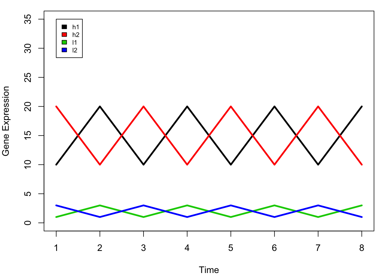
In this dummy example, we have four genes (l1, l2, h1, h2) that are measured in 8 time points.
when we do clustering, we want to cluster l1 h1 together, and l2 h2 together as they have the same trend across the time points. However, you will notice that the scale of the expression levels of these four genes are different: with h1 and h2 are high, and l1 l2 are low.
If we calculate the distance:
#?dist to see other distance measures
dist(mat)
## h1 h2 l1
## h2 28.284271
## l1 38.470768 40.496913
## l2 40.496913 38.470768 5.656854## I will use the default for linkage method: complete
plot(hclust(dist(mat)))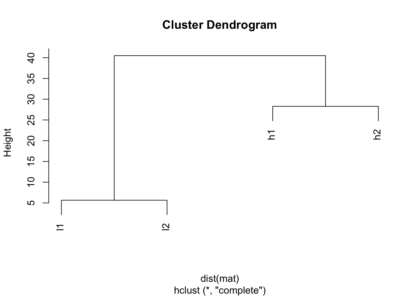
The default distance measure is Eucledian distance, and you will see h1 and h2 are closer (28.284271), l1 and l2 are closer. This simply because how euclidean distance is defined.
Let’s check the help for ?heatmap:
scale character indicating if the values should be centered and scaled in either the row direction or the column direction, or none. The default is “row” if symm false, and “none” otherwise.
symm logical indicating if x should be treated symmetrically; can only be true when x is a square matrix.
So the default is scale row inside the heatmap.
## default, I will give parameters explicitly
heatmap(mat, Colv=NA, col=greenred(10), scale = "row")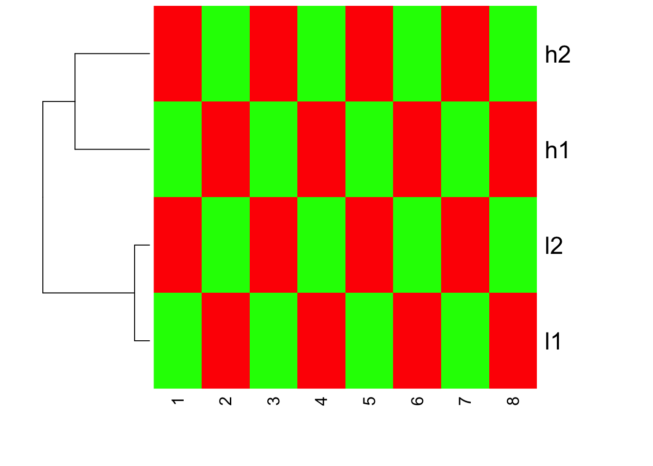
We do see h1,h2 cluster together; l1 l2 cluster together. Inside heatmap function, the default distance measure is the same as default of dist, the linkage method is the same as hclust.
If you read the heatmap carefully, you will find that h1,h2 are with large values, but they have the same red color as l1,l2. This confirms that heatmap does clustering first, and then scale the row for representing the color!
How about if we turn off scale inside heatmap?
heatmap(mat, Colv = NA, col=greenred(10), scale = "none")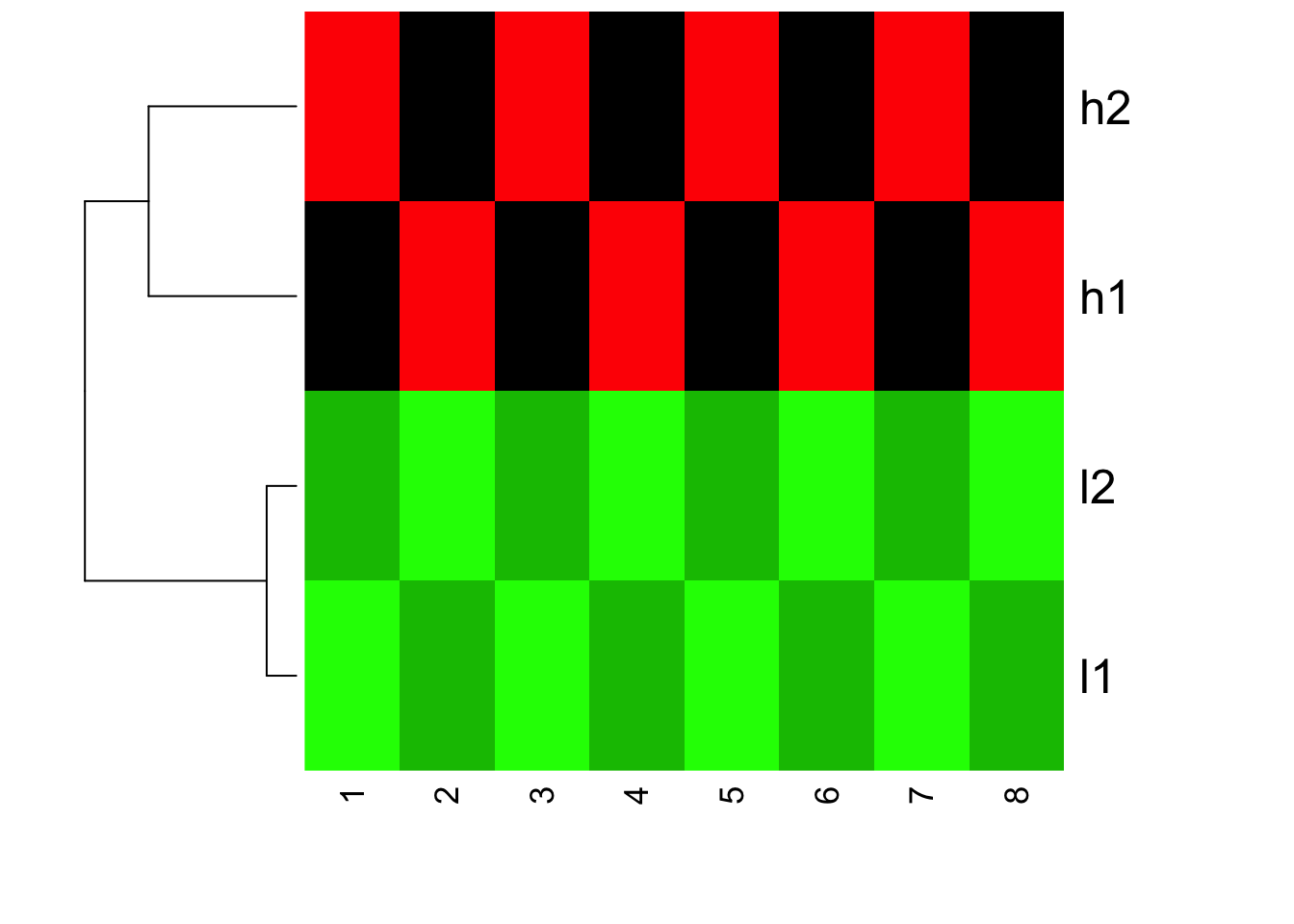
You will see the clustering does not change, but the color changed! l1 and l2 are all green now (small values)
How about if we scale the genes before we feed into heatmap? scale works on columns, transpose for rows.
mat.scaled<- t(scale(t(mat), center=TRUE, scale = TRUE))
mat.scaled
## [,1] [,2] [,3] [,4] [,5] [,6]
## h1 -0.9354143 0.9354143 -0.9354143 0.9354143 -0.9354143 0.9354143
## h2 0.9354143 -0.9354143 0.9354143 -0.9354143 0.9354143 -0.9354143
## l1 -0.9354143 0.9354143 -0.9354143 0.9354143 -0.9354143 0.9354143
## l2 0.9354143 -0.9354143 0.9354143 -0.9354143 0.9354143 -0.9354143
## [,7] [,8]
## h1 -0.9354143 0.9354143
## h2 0.9354143 -0.9354143
## l1 -0.9354143 0.9354143
## l2 0.9354143 -0.9354143
## attr(,"scaled:center")
## h1 h2 l1 l2
## 15 15 2 2
## attr(,"scaled:scale")
## h1 h2 l1 l2
## 5.345225 5.345225 1.069045 1.069045Let’s see how the distance change among genes:
dist(mat.scaled)## h1 h2 l1
## h2 5.291503
## l1 0.000000 5.291503
## l2 5.291503 0.000000 5.291503plot(hclust(dist(mat.scaled)))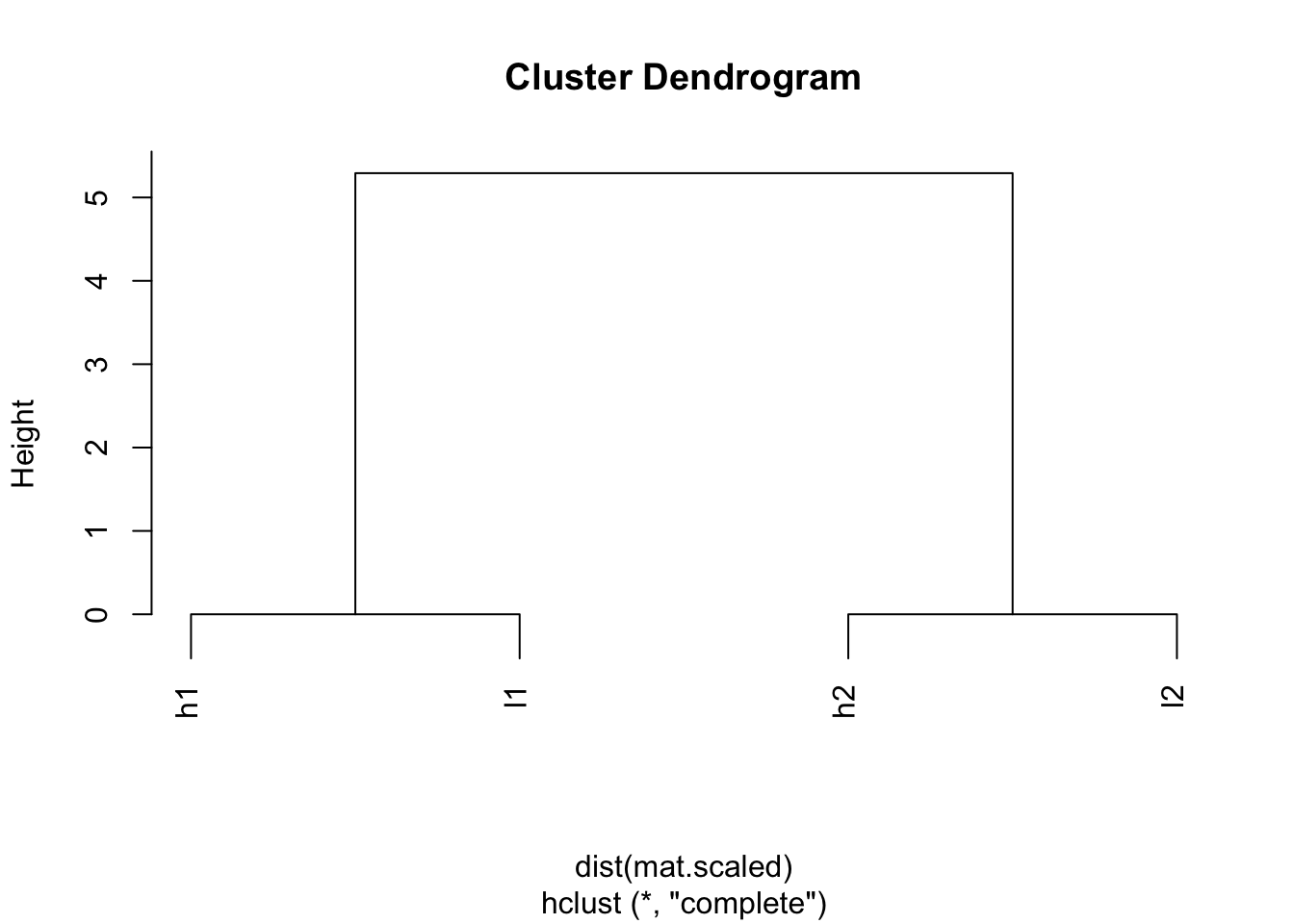
Wow! h1 and l1 are clustered together; l2 and h2 are clustered together.
heatmap(mat.scaled, Colv = NA, col=greenred(10), scale = "none")
I hope you understand now how scale the data before or after can affect the looking of your heatmaps.
If we do not scale the data beforehand, but we still want l1 and h1 cluster together; l2 and h2 cluster together, we can use a different distance measure.
## correlation among the genes
cor(t(mat))
## h1 h2 l1 l2
## h1 1 -1 1 -1
## h2 -1 1 -1 1
## l1 1 -1 1 -1
## l2 -1 1 -1 1## 1- correation to define the distance
1- cor(t(mat))## h1 h2 l1 l2
## h1 0 2 0 2
## h2 2 0 2 0
## l1 0 2 0 2
## l2 2 0 2 0hc <- hclust(as.dist(1-cor(t(mat))))
plot(hc)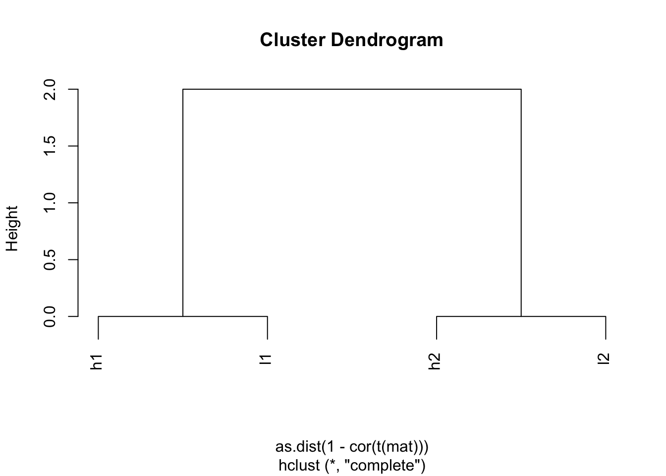
Indeed, h1 and l1 are together; h2 and l2 are together.
Now, we plot the heatmap, but set scale = “none” inside heatmap
heatmap(mat, Colv = NA, Rowv=as.dendrogram(hc), col=greenred(10), scale = "none")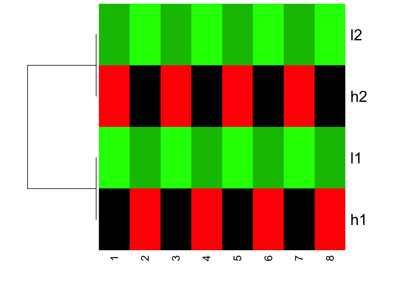
Is this what you expect?! Yes, l1 and h2 are clustered together; l1 and h1 clustered together. but because the value range are different, you see l1 and l2 are green (small values); h1 and h2 are red (big values).
The magic will happen if we set scale =“row” which is the default:
heatmap(mat, Colv = NA, Rowv=as.dendrogram(hc), col=greenred(10), scale = "row")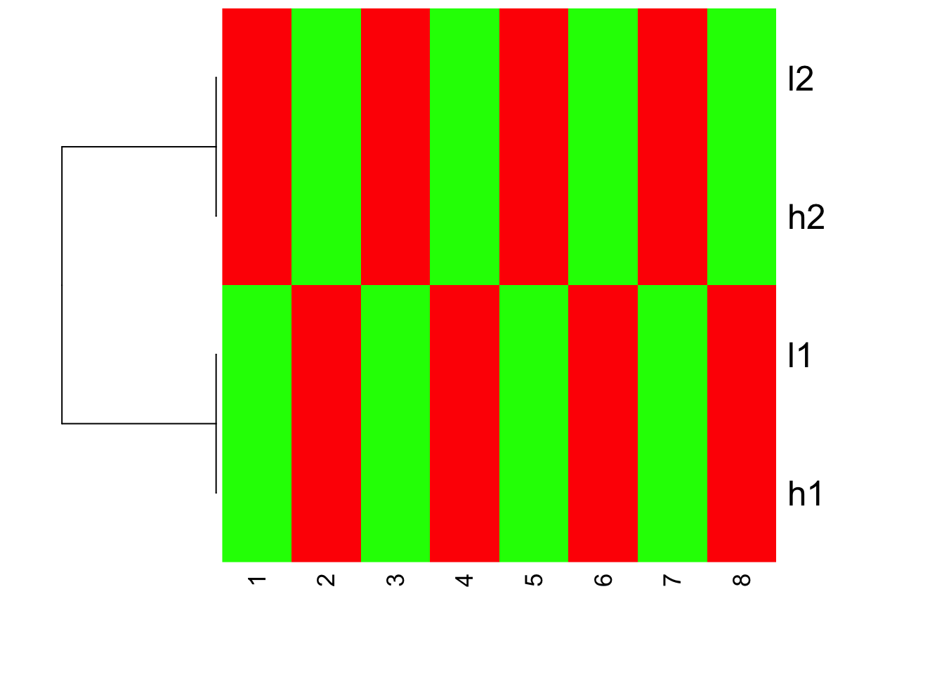
I hope I have clarified a bit for the complications of heatmaps.
heatmap.2 function in gplots package
scale character indicating if the values should be centered and scaled in either the row direction or the column direction, or none. The default is “none”.
The default is none!!
Please also pay attention to the Color Key of the heatmap.
## defaults of heatmap.2, scale is none
heatmap.2(mat, trace = "none", Colv= NA, dendrogram = "row", scale = "none")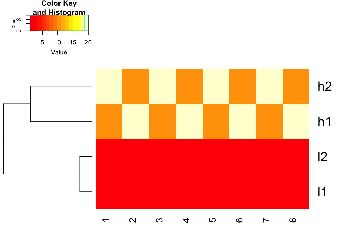
## FACT of heatmap functions in R: it does clustering first and then use the scale argument (if set) to represent the data.
heatmap.2(mat, trace = "none", Colv= NA, dendrogram = "row", scale = "row")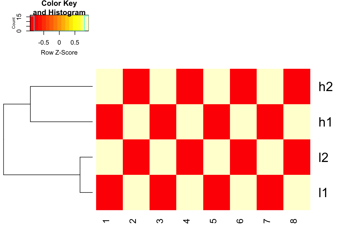
how about we scale the data explicitly first and use euclidean distance. works fine!
heatmap.2(t(scale(t(mat), center=TRUE, scale=TRUE)), trace = "none", Colv= NA, dendrogram = "row", scale = "none")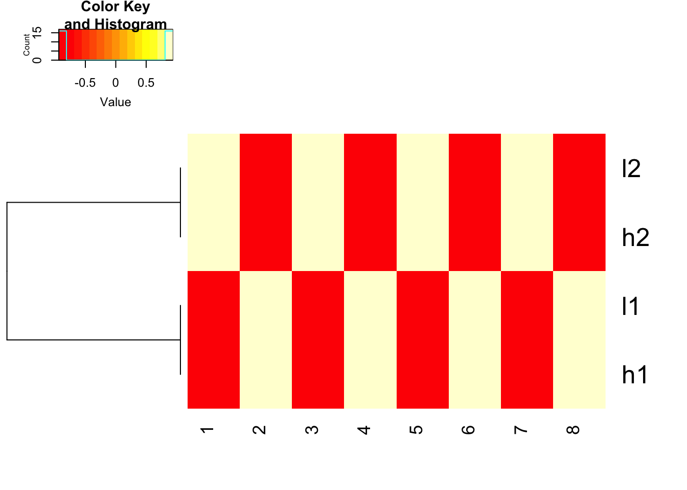
use 1- cor(x) as distance and do not scale before hand
heatmap.2(mat, trace = "none",
          Colv= NA, dendrogram = "row",
          scale = "none",
          hclust=function(x) hclust(x, method='complete'), distfun=function(x) as.dist(1-cor(t(x))))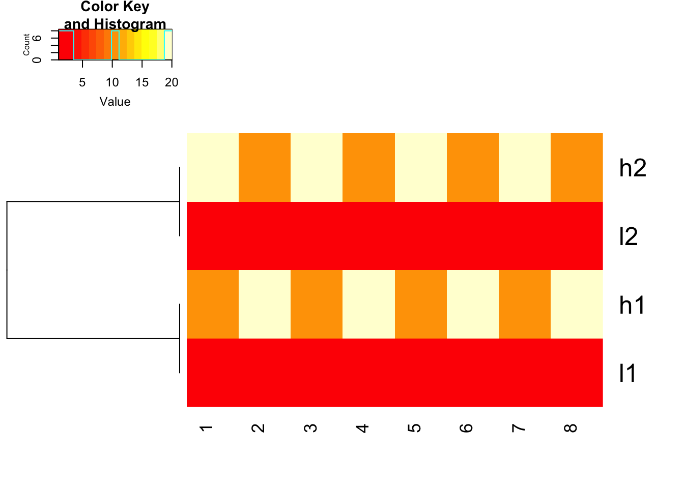
use 1- cor(x) as distance and do not scale before hand, but use scale in the heatmap.2 function to represent the colors
heatmap.2(mat, trace = "none",
          Colv= NA, dendrogram = "row",
          scale = "row",
          hclust=function(x) hclust(x, method='complete'), distfun=function(x) as.dist(1-cor(t(x))))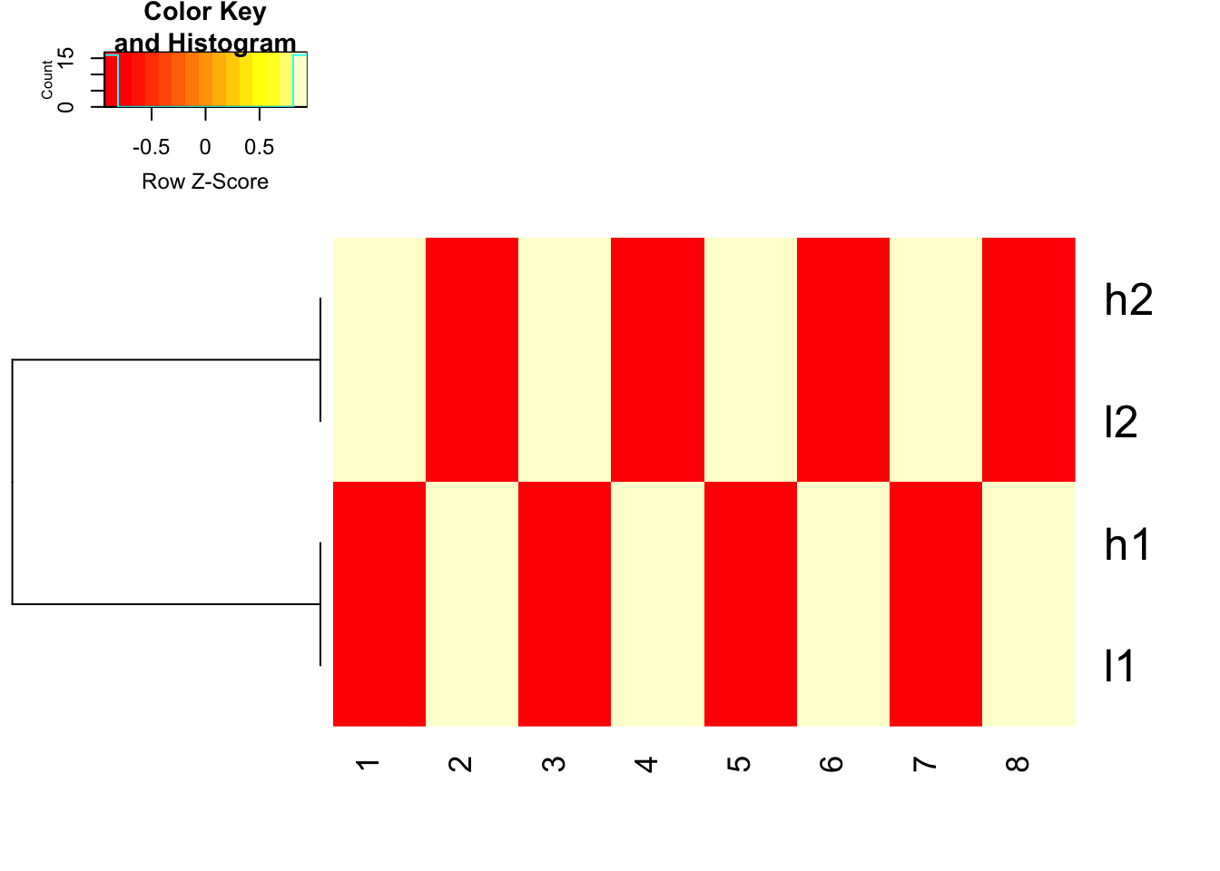
scale before hand and use 1- cor(x) as distance
heatmap.2(t(scale(t(mat), center=TRUE, scale=TRUE)), trace = "none",
          Colv= NA, dendrogram = "row",
          hclust=function(x) hclust(x, method='complete'), distfun=function(x) as.dist(1-cor(t(x))))
Note that the dendrogram can be rotated and without changing the clustering. Check Dendersort if you want to specify the order of the dendrogram.
The ComplexHeatmap package which now I am using mainly does not do any scaling inside the Heatmap function.
Take home messages
Generate heatmap is easy, but make sure to understand the parameters in each heatmap function.
Understand your data and what you are looking for. Do you need to scale your data before clustering?
Distance measure and linkage method can drastically affect your clustering. Choose the right one for your data!. Please also read my last post on this theme.