When it comes to make a heatmap, ComplexHeatmap by Zuguang Gu is my favorite. Check it out! You will be amazed on how flexible it is and the documentation is in top niche.
For Single-cell RNAseq, Seurat provides a DoHeatmap function using ggplot2. There are two limitations:
when your genes are not in the top variable gene list, the
scale.datawill not have that gene andDoHeatmapwill drop those genes.ggplot2does not support clustering of the rows or columns.
I highly recommend you to read two posts I wrote as well on heatmap:
Let me walk you through how I replicate and enhance the Seurat version of heatmap using ComplexHeatmap.
follow the tutorial https://satijalab.org/seurat/v3.2/pbmc3k_tutorial.html
library(dplyr)
library(Seurat)
library(ComplexHeatmap)
# https://github.com/immunogenomics/presto
library(presto)
library(tictoc)
# Load the PBMC dataset
pbmc.data <- Read10X(data.dir = "~/Downloads/filtered_gene_bc_matrices/hg19/")
pbmc <- CreateSeuratObject(counts = pbmc.data, project = "pbmc3k", min.cells = 3, min.features = 200)
## Warning: Feature names cannot have underscores ('_'), replacing with dashes
## ('-')
pbmc
## An object of class Seurat
## 13714 features across 2700 samples within 1 assay
## Active assay: RNA (13714 features)
pbmc[["percent.mt"]] <- PercentageFeatureSet(pbmc, pattern = "^MT-")

## ScaleData uses top variable genes only
pbmc<- pbmc %>%
  NormalizeData(normalization.method = "LogNormalize", scale.factor = 10000) %>%
  FindVariableFeatures(selection.method = "vst", nfeatures = 2000) %>%
  ScaleData() %>%
  RunPCA() %>%
  FindNeighbors(dims = 1:10) %>%
  FindClusters(resolution = 0.5) %>%
  RunUMAP(dims = 1:10)
## Modularity Optimizer version 1.3.0 by Ludo Waltman and Nees Jan van Eck
##
## Number of nodes: 2700
## Number of edges: 97958
##
## Running Louvain algorithm...
## Maximum modularity in 10 random starts: 0.8717
## Number of communities: 9
## Elapsed time: 0 seconds
## Warning: The default method for RunUMAP has changed from calling Python UMAP via reticulate to the R-native UWOT using the cosine metric
## To use Python UMAP via reticulate, set umap.method to 'umap-learn' and metric to 'correlation'
## This message will be shown once per session
DimPlot(pbmc, reduction = "umap")
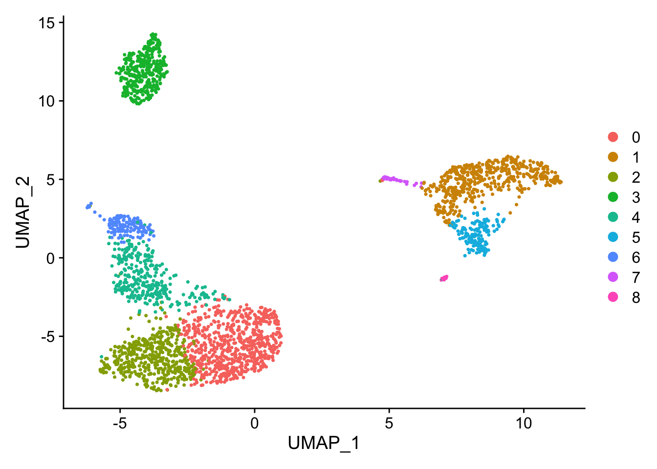
The UMAP plot looks a bit different from the tutorial, but the structure is similar enough (You see how difficult it is to reproduce the exactly the same figure even with the same code:)).
Let’s find marker genes for each cluster. I like presto for this purpose. It is much faster than Seurat.
tic()
markers<- presto::wilcoxauc(pbmc, 'seurat_clusters', assay = 'data')
toc()
## 0.419 sec elapsed
markers<- top_markers(markers, n = 10, auc_min = 0.5, pct_in_min = 20, pct_out_max = 20)

markers
## # A tibble: 10 x 10
##     rank `0`      `1`    `2`    `3`      `4`   `5`         `6`   `7`     `8`
##    <int> <chr>    <chr>  <chr>  <chr>    <chr> <chr>       <chr> <chr>   <chr>
##  1     1 CCR7     S100A8 AQP3   CD79A    GZMA  FCGR3A      GZMB  FCER1A  PPBP
##  2     2 PIK3IP1  FCN1   TRAT1  CD79B    CST7  IFITM3      PRF1  CLEC10A NRGN
##  3     3 PRKCQ-A… LGALS2 SPOCK2 MS4A1    GZMK  RP11-290F2… GNLY  HLA-DQ… PF4
##  4     4 LEF1     CFD    CD27   HLA-DQA1 LYAR  CFD         FGFB… CPVL    SDPR
##  5     5 TCF7     GRN    TRADD  HLA-DQB1 GZMM  MS4A7       CST7  HLA-DMB GNG11
##  6     6 CD27     MS4A6A CD3G   TCL1A    CD8A  CD68        GZMA  CD33    SPARC
##  7     7 MAL      AP1S2  RGCC   LINC009… KLRG1 SPI1        FCGR… CTSH    RGS18
##  8     8 RGCC     CD14   CD40LG HLA-DMA  PRF1  RHOC        SPON2 RNASE6  HIST1H…
##  9     9 CD3G     CD68   LAT    VPREB3   GZMH  HCK         CCL4  KLF4    TPM4
## 10    10 LDLRAP1  LGALS3 FLT3LG HLA-DQA2 HOPX  IFI30       APMAP RNF130  GP9
DoHeatmap
all_markers<- markers %>%
  select(-rank) %>%
  unclass() %>%
  stack() %>%
  pull(values) %>%
  unique() %>%
   .[!is.na(.)]
DoHeatmap(pbmc, features = all_markers) + NoLegend()
## Warning in DoHeatmap(pbmc, features = all_markers): The following features were
## omitted as they were not found in the scale.data slot for the RNA assay: TPM4,
## RNF130, KLF4, RNASE6, CTSH, CD33, CPVL, APMAP, HCK, RHOC, RP11-290F20.3, CD8A,
## GZMM, VPREB3, FLT3LG, LAT, CD40LG, SPOCK2, TRAT1, CD68, CD14, AP1S2, GRN, CD3G,
## RGCC, CD27, TCF7, LEF1, PRKCQ-AS1, PIK3IP1, CCR7
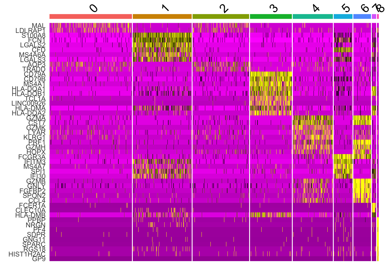
you see warnings:“the following features were omitted as they were not found in the scale.data slot for the RNA assay”. The color mapping looks different from the tutorial. It could be different Seurat version uses different parameters. I have not check the code base change.
replicate the heatmap using Complexheatmap
We can go back to the data slot to get all the genes
mat<- pbmc[["RNA"]]@data[all_markers, ] %>% as.matrix()

## scale the rows
mat<- t(scale(t(mat)))

cluster_anno<- pbmc@meta.data$seurat_clusters
We can explicitly map the colors to the scaled expression values
# what's the value range in the matrix
quantile(mat, c(0.1, 0.95))
##        10%        95%
## -0.5277426  2.3470090
Seurat::PurpleAndYellow()
##  [1] "#FF00FF" "#F400F4" "#EA00EA" "#DF00DF" "#D500D5" "#CA00CA" "#BF00BF"
##  [8] "#B500B5" "#AA00AA" "#9F009F" "#950095" "#8A008A" "#800080" "#750075"
## [15] "#6A006A" "#600060" "#550055" "#4A004A" "#400040" "#350035" "#2B002B"
## [22] "#200020" "#150015" "#0B000B" "#000000" "#000000" "#0B0B00" "#151500"
## [29] "#202000" "#2B2B00" "#353500" "#404000" "#4A4A00" "#555500" "#606000"
## [36] "#6A6A00" "#757500" "#808000" "#8A8A00" "#959500" "#9F9F00" "#AAAA00"
## [43] "#B5B500" "#BFBF00" "#CACA00" "#D4D400" "#DFDF00" "#EAEA00" "#F4F400"
## [50] "#FFFF00"
## make the black color map to 0. the yellow map to highest and the purle map to the lowest
col_fun = circlize::colorRamp2(c(-1, 0, 3), c("#FF00FF", "black", "#FFFF00"))
plot the heatmap
Heatmap(mat, name = "Expression",
        column_split = factor(cluster_anno),
        cluster_columns = TRUE,
        show_column_dend = FALSE,
        cluster_column_slices = TRUE,
        column_title_gp = gpar(fontsize = 8),
        column_gap = unit(0.5, "mm"),
        cluster_rows = TRUE,
        show_row_dend = FALSE,
        col = col_fun,
        row_names_gp = gpar(fontsize = 4),
        column_title_rot = 90,
        top_annotation = HeatmapAnnotation(foo = anno_block(gp = gpar(fill = scales::hue_pal()(9)))),
        show_column_names = FALSE,
        use_raster = TRUE,
        raster_quality = 4)
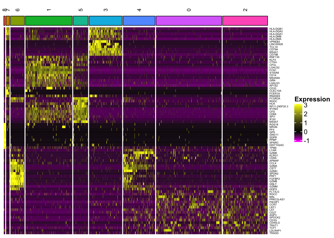
In addition to the capability to plot all the genes, one can cluster the rows (genes) and the columns (cells) within each slice (cell type), and slices can be further clustered as well.
Several other notes:
- When you have too many cells (> 10,000), the
use_rasteroption really helps. Also consider downsample the Seurat object to a smaller number of cells for plotting the heatmap. Your screen resolution is not as high as 300,000 pixels if you have 300,000 cells (columns).
Please read https://jokergoo.github.io/2020/06/30/rasterization-in-complexheatmap/ and Plotting heatmaps from big matrices in R
check tidyHeatmap built upon
Complexheatmapfor tidy dataframe.aplot from Guangchuang Yu.
superheat from Rebecca Barter.