In scanpy, there is a function to create a stacked violin plot.
 There is no such function in
 Seurat, and many people were asking for this feature.
e.g. https://github.com/satijalab/seurat/issues/300
https://github.com/satijalab/seurat/issues/463
The developers have not implemented this feature yet. In this post, I am trying to make a stacked violin plot in Seurat.
The idea is to create a violin plot per gene using the VlnPlot in Seurat, then
customize the axis text/tick and reduce the margin for each plot and finally concatenate by
cowplot::plot_grid or patchwork::wrap_plots.
library(Seurat)
library(patchwork)
library(ggplot2)

## remove the x-axis text and tick
## plot.margin to adjust the white space between each plot.
## ... pass any arguments to VlnPlot in Seurat
modify_vlnplot<- function(obj,
                          feature,
                          pt.size = 0,
                          plot.margin = unit(c(-0.75, 0, -0.75, 0), "cm"),
                          ...) {
  p<- VlnPlot(obj, features = feature, pt.size = pt.size, ... )  +
    xlab("") + ylab(feature) + ggtitle("") +
    theme(legend.position = "none",
          axis.text.x = element_blank(),
          axis.ticks.x = element_blank(),
          axis.title.y = element_text(size = rel(1), angle = 0),
          axis.text.y = element_text(size = rel(1)),
          plot.margin = plot.margin )
  return(p)
}

## extract the max value of the y axis
extract_max<- function(p){
  ymax<- max(ggplot_build(p)$layout$panel_scales_y[[1]]$range$range)
  return(ceiling(ymax))
}


## main function
StackedVlnPlot<- function(obj, features,
                          pt.size = 0,
                          plot.margin = unit(c(-0.75, 0, -0.75, 0), "cm"),
                          ...) {

  plot_list<- purrr::map(features, function(x) modify_vlnplot(obj = obj,feature = x, ...))

  # Add back x-axis title to bottom plot. patchwork is going to support this?
  plot_list[[length(plot_list)]]<- plot_list[[length(plot_list)]] +
    theme(axis.text.x=element_text(), axis.ticks.x = element_line())

  # change the y-axis tick to only max value
  ymaxs<- purrr::map_dbl(plot_list, extract_max)
  plot_list<- purrr::map2(plot_list, ymaxs, function(x,y) x +
                            scale_y_continuous(breaks = c(y)) +
                            expand_limits(y = y))

  p<- patchwork::wrap_plots(plotlist = plot_list, ncol = 1)
  return(p)
}
Testing the function
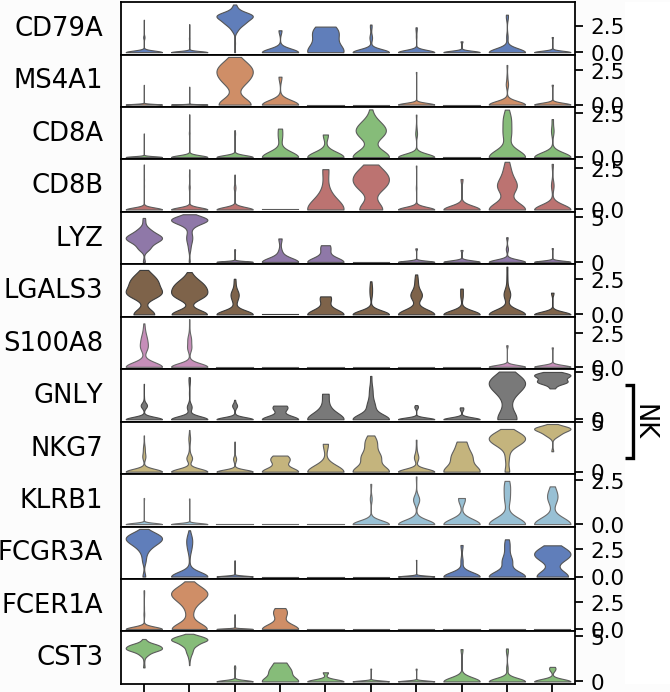
pbmc<- readRDS("~/projects/EvaluateSingleCellClustering/data/pbmc_5k_v3.rds")
features<- c("CD79A", "MS4A1", "CD8A", "CD8B", "LYZ", "LGALS3", "S100A8", "GNLY",
             "NKG7", "KLRB1", "FCGR3A", "FCER1A", "CST3")

StackedVlnPlot(obj = pbmc, features = features)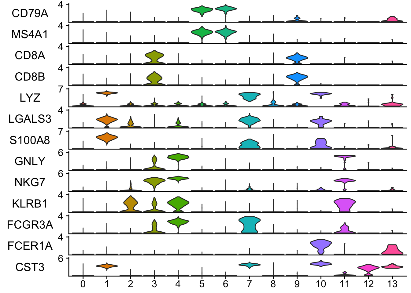
## any arguments for Vlnplot can be passed to the StackedVlnPlot. e.g. idents.
## only cluster 1-5
StackedVlnPlot(obj = pbmc, features = features, idents = c(1,2,3,4,5) )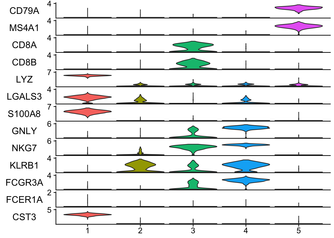
The code can be better designed, and also I should add checks ... using ellipsis package. Nevertheless, it is working and gives me desired layout :)